
How to transform a website into responsive website?Website Providers & Internet DevelopmentUpdated on Jun 24, 2016 View more like this | Visit DELHI, NY | Contact Manoj Aggarwal |
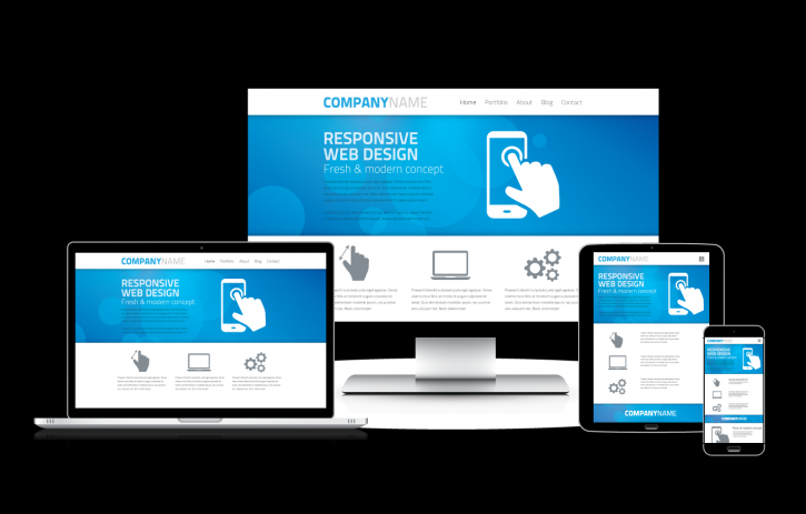
Responsive design is when your site automatically fits in the user’s device. It’s super easy to be mobile-friendly, you just have to know a little about devices, media queries and how to do small changes in your layout.
Responsive website design is focused around providing an intuitive and gratifying experience for everyone. Desktop computer and cell phone users alike all benefit from responsive websites.
Mobile friendly website design has grown especially with increase in use of mobile gadgets. Many web-designing companies struggle to even promote companies commodities since clients cant access.
Some problems listed with unresponsive websites are:
• Difficult to navigate; the main navigation menus do not appear in the mobile viewer, or if they do they do not render clearly.
• Images do not fit; large images will only be partially visible. This looks very unprofessional and can put your customer off visiting your website again. Images and graphics were fine when they took up 800px width but, now Smartphone view ports are less than 400px wide.
• Requires too much scroll, pinch and zoom.
In this article, a few ways to take your current site and turn it into a mobile friendly one and responsive website. CSS basics, HTML optimization, Word Press and jQuery plugins are among tools to consider.
1. OS and browsers
The OS types include IOS, Android, BlackBerry OS, Symbian OS and WebOS. Browsers include Safari, Dolphin, Android Webkit and Opera mobile. These browsers and OS are purposely made for use in mobile devices. The pixel density improves the outlook of a website, which gives better images for iOS.
2. CSS (Media queries)
Media queries are simple rules you add in your CSS to target only devices included on the rules. Some elements can be rearranged to improve responsiveness of the web design:
• Replace the menu with a dropdown.
• Hiding sidebar elements
• Reposition elements
• Jump to” links
• Shortcuts and tools
3. WordPress Plugins
These features help extend functionality or add new features to your WordPress websites. WordPress plugins are written in the PHP programming language and integrate seamlessly with WordPress. These Plugins include JQuery plugins, WP Fluid Images.
A grid system an also increase responsiveness on smaller monitors as it adapts to the browser width. The most recent extension for Fireworks users is Export Responsive Prototype.
CONCLUSION
Unresponsive websites are common with many websites. However, the above measures will help create a mobile friendly and responsive website.Also you can hire a website designing company to fulfill your web requirements.
Responsive website design is focused around providing an intuitive and gratifying experience for everyone. Desktop computer and cell phone users alike all benefit from responsive websites.
Mobile friendly website design has grown especially with increase in use of mobile gadgets. Many web-designing companies struggle to even promote companies commodities since clients cant access.
Some problems listed with unresponsive websites are:
• Difficult to navigate; the main navigation menus do not appear in the mobile viewer, or if they do they do not render clearly.
• Images do not fit; large images will only be partially visible. This looks very unprofessional and can put your customer off visiting your website again. Images and graphics were fine when they took up 800px width but, now Smartphone view ports are less than 400px wide.
• Requires too much scroll, pinch and zoom.
In this article, a few ways to take your current site and turn it into a mobile friendly one and responsive website. CSS basics, HTML optimization, Word Press and jQuery plugins are among tools to consider.
1. OS and browsers
The OS types include IOS, Android, BlackBerry OS, Symbian OS and WebOS. Browsers include Safari, Dolphin, Android Webkit and Opera mobile. These browsers and OS are purposely made for use in mobile devices. The pixel density improves the outlook of a website, which gives better images for iOS.
2. CSS (Media queries)
Media queries are simple rules you add in your CSS to target only devices included on the rules. Some elements can be rearranged to improve responsiveness of the web design:
• Replace the menu with a dropdown.
• Hiding sidebar elements
• Reposition elements
• Jump to” links
• Shortcuts and tools
3. WordPress Plugins
These features help extend functionality or add new features to your WordPress websites. WordPress plugins are written in the PHP programming language and integrate seamlessly with WordPress. These Plugins include JQuery plugins, WP Fluid Images.
A grid system an also increase responsiveness on smaller monitors as it adapts to the browser width. The most recent extension for Fireworks users is Export Responsive Prototype.
CONCLUSION
Unresponsive websites are common with many websites. However, the above measures will help create a mobile friendly and responsive website.Also you can hire a website designing company to fulfill your web requirements.
